Katja Garrood, Creative Director of Brand Watch Social Media Monitoring, has worked up new designs for MurrayNewlands.com.
We would like YOUR input to choose which designs to use.
There are TWO surveys – one to choose which of four headers and another to choose which of four designs.
Click once on each image to open it in a new window and again to enlarge it.
PART ONE: Which of these four header scamps do you like best? The images are what is different – number them 1 (top), 2, 3 and 4 (bottom) to vote in the poll.
HEADER CHOICES:
- Murray head shot photo
- Murray sitting on a conference panel
- Murray doing a video or Skype conference call
- Murray speaking at a podium
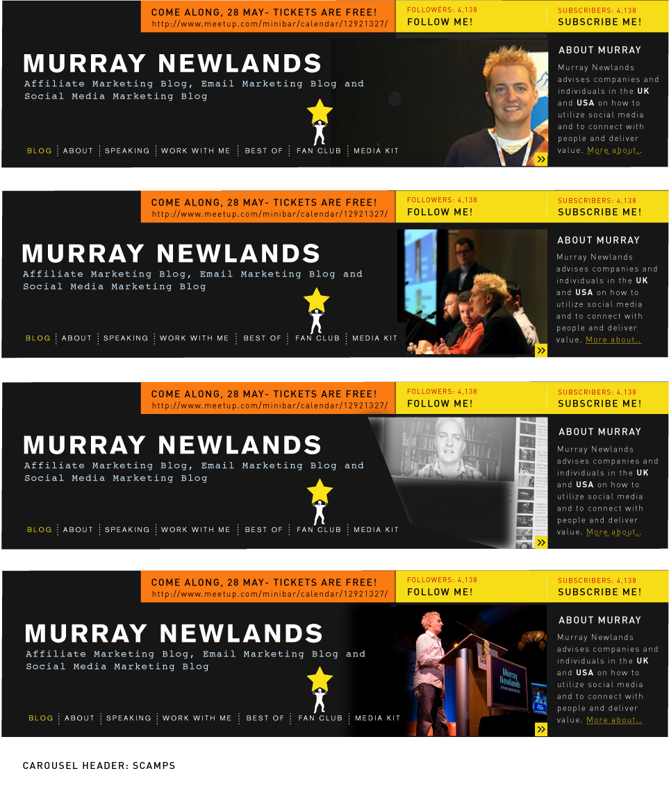
Choose One Header for the redesigned MurrayNewlands.com - Click image to make them larger and see more detail.
PART TWO: Which of these redesigns do you like best?
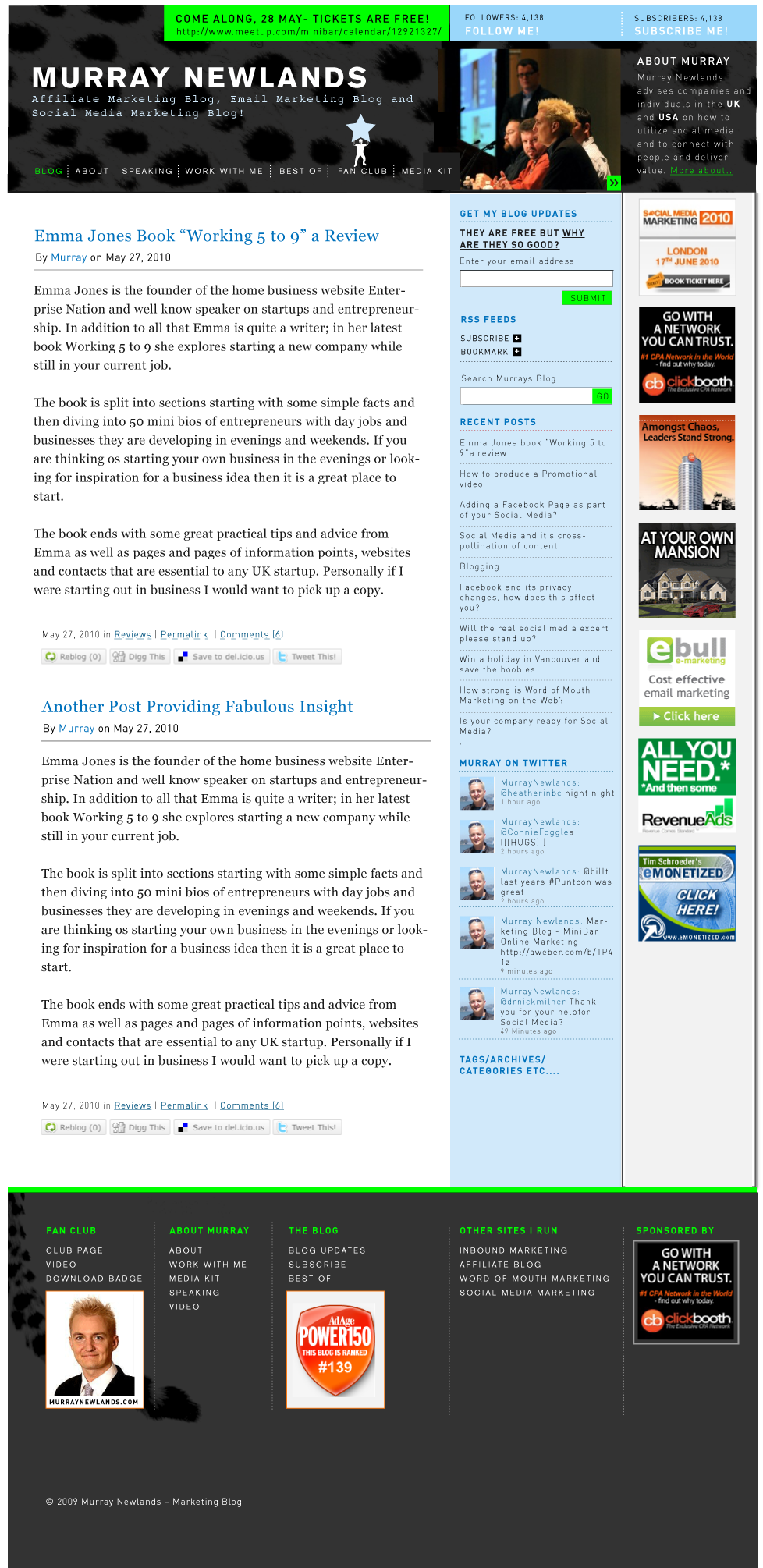
Redesign #1 BLUE – header is green and blue at the top and the center column is blue.
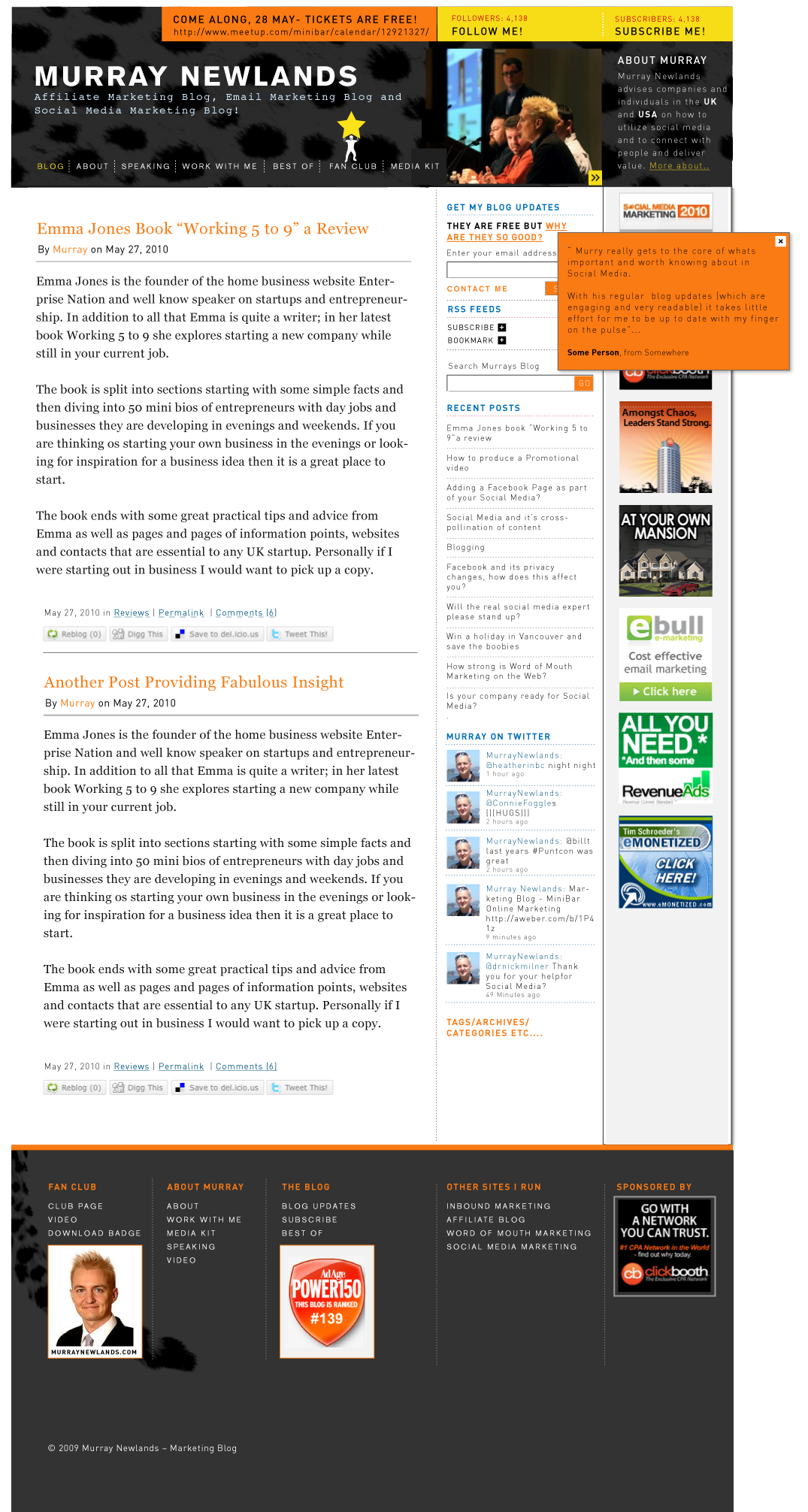
Redesign #2 ORANGE – header is orange and yellow at the top and titles and mouseover boxes are orange.
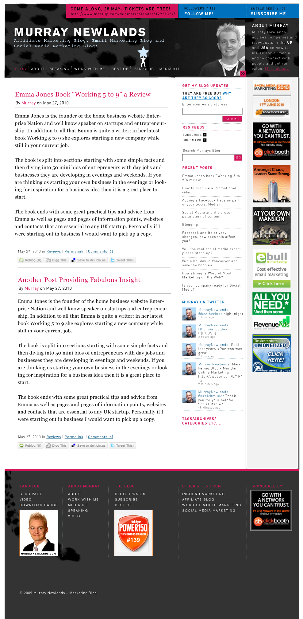
Redesign #3 RED Header is red and blue at the top and titles, highlights and mouseover boxes are red.
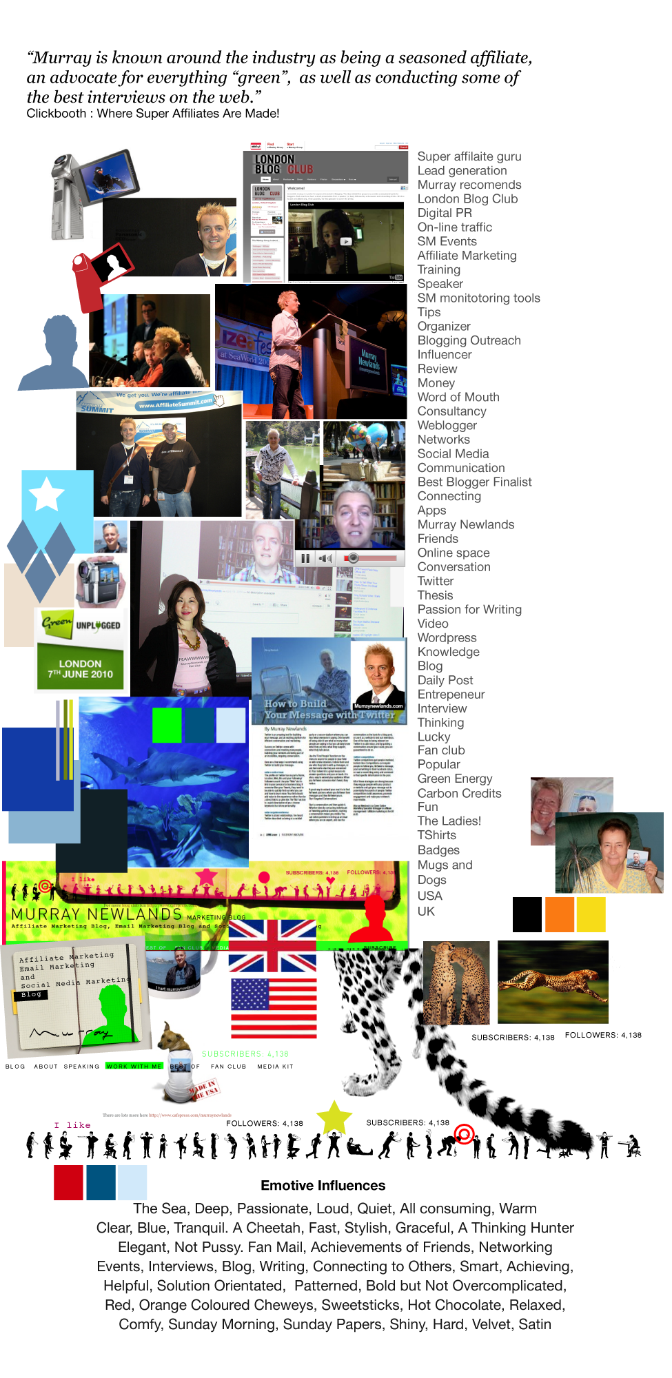
Redesign #4 Moodboard

4 comments on “Which MurrayNewlands Redesign Do YOU Prefer?”
The orange, yellow and black is great – and I like the updated head-shot. If you don’t use it on your header, I think you should use it to replace that stuffy looking suited guy 😉
I agree with heather. The orange and yellow looks great.
but to be honest they all look great.
The best thing about the redesign for me is the search this blog box. That is my personal favorite feature in any blog – that and having the Twitter and subscribe links right at the top. Both are VERY important. Kudos to Katja.
Redesigns looking good, Murray. I like the conference shot best, though it would be better if it was straight on, not profile. The one I think would be better than all of the options is the one you have for twitter- with the city in the background and the sunglasses.
As for layout, Moodboard #4- Not into it.
The blue strip down the middle design? Into it.
Comments are closed.